雅思小作文线状图类题目高分范文及名师点评!
雅思小作文线状图类题目高分范文及名师点评!对于这类写作题目不太熟悉的学生可以参考一下范文;
题目
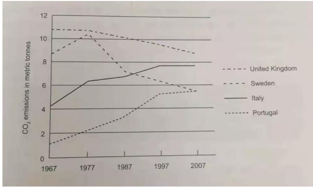
The graph below shows average carbon dioxide emissions per person in the United Kingdom. Sweden,Italy and Portugal between 1967 and 2007.
Summarise the information by selecting and reporting the main features and make comparisons where relevant. (C11T3)

范文
The line graph shows the amount of carbon dioxide emissions per capita in four different countries, the United Kingdom, Sweden, Italy and Portugal between 1967 and 2007.
It is clear that the general trend of Italy and Portugal rose slowly over this period, whilst the United Kingdom and Sweden fell over the same period. Sweden experienced a dramatic decrease between 1977 and 2007.
In 1967, the United Kingdom had the highest percentage of emissions at nearly 11 metric tons per person, followed by Sweden and Italy at around 8.5 metric tons and 4.2 metric tons respectively. Portugal emitted the lowest amount of carbon dioxide with less than 2 metric tons.
Over the following 40 years, the emission in the UK had dropped and reached approximately 9 metric tons in 2007. In addition, Sweden's carbon dioxide emissions per person reached a peak at just over 10 tons in 1977 and then began to decline, dropping to 5.5 metric tons in 2007. Italy’s emissions per person exceeded Swedens in 1989. Continuing to rise, they reached slightly below 8 metric tons in 2007, while Portugal's growth was most significant, with the final emissions equally Sweden's number of emissions.
该线状图显示了1967年至2007年间英国、瑞典、意大利和葡萄牙四个不同国家的人均二氧化碳排放量。
很明显,在此期间意大利和葡萄牙的总体趋势是缓慢上升的,而英国和瑞典的趋势则是下降的。瑞典在1977年至2007年间经历了急剧下降。
1967年,英国的人均二氧化碳排放量百分比最高,为每人近11吨,其次是瑞典和意大利,分别约为8.5吨和4.2吨。葡萄牙的人均二氧化碳排放量最低,不到2吨。
在接下来的40年中,英国的人均二氧化碳排放量一直在下降,在2007年下降到约9吨的水平。此外,瑞典的人均二氧化碳排放量在1977年达到峰值,超过10吨,然后开始下降,在2007年下降到5.5吨。意大利的人均排放量在1989年超过瑞典,然后继续增长,在2007年略低于8吨,而葡萄牙的增长最为显著,最终排放量与瑞典的排放量相当。
名师点评
第一段改写题目。第二段概述图中每条线的总体趋势和走向。第三段描述1967年各个国家人均二氧化碳排放量的情況。第四段主要描述40年后各个国家人均二氧化碳排放量的情况。
总体来说,本文分段合理,四段式结构是一种比常见的分段方式如果考生对于线状图的写作内容不,又担心在分的过程中处理不好数据,那么完全可以借鉴这篇文章。


